freja

+ photographer + art direction
+ illustrator + brand designer

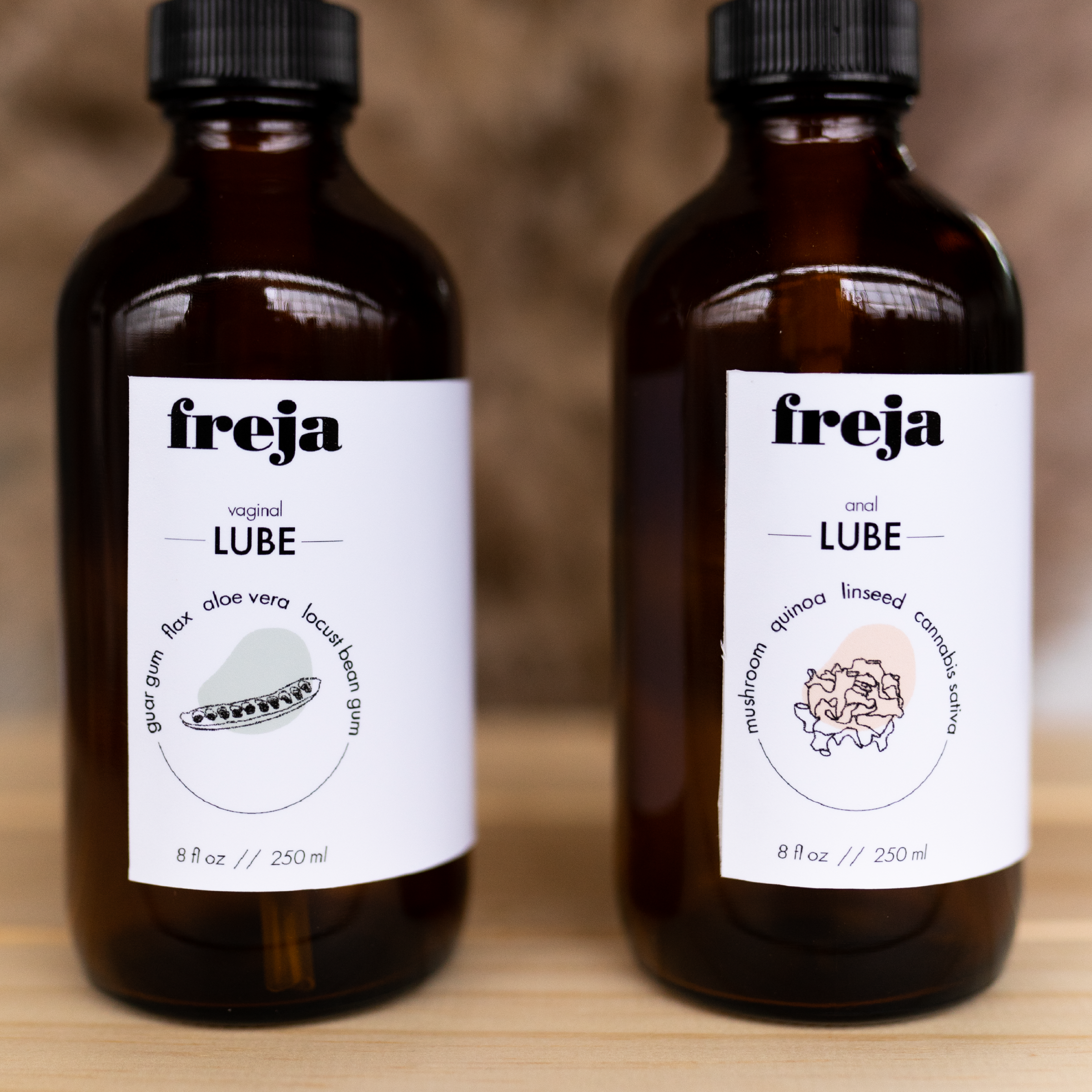
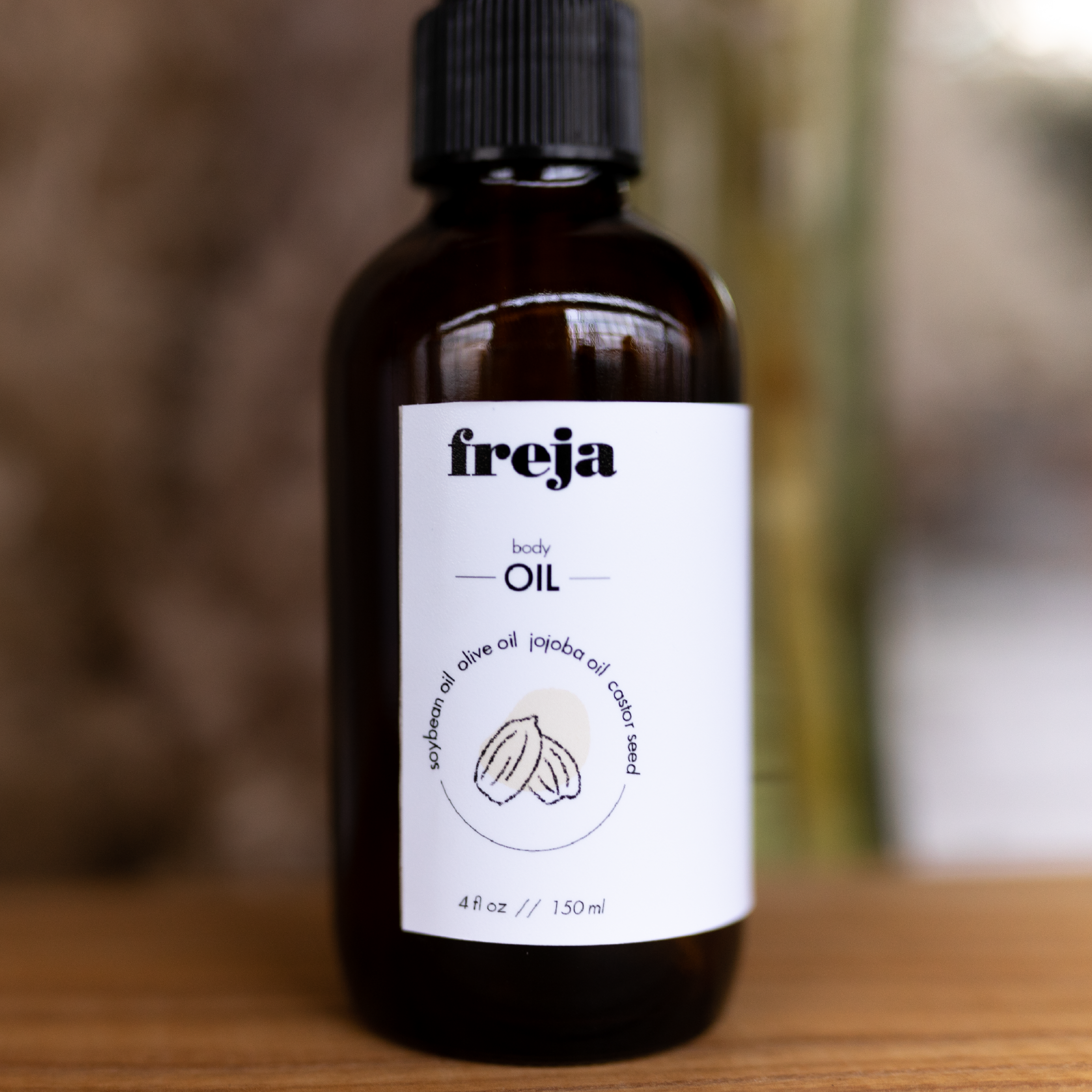
freja was born from the belief that queer and underrepresented bodies deserve care that sees them, honors them, and never asks them to shrink.

I shaped a visual identity rooted in softness, confidence, and everyday intimacy—design that feels human, expressive, and unafraid to take up space. A brand built for every body and every identity, made to feel welcoming the moment you meet it.

Blurred background with various hand-drawn style illustrations of food items: coconut, lemon, pea pod, lettuce, rice stalk, soy sauce bowl, and garlic, overlaid on the image.
Two dark brown jars with white labels featuring a simple illustration of a bowl, placed on a light wooden surface. The labels contain text about inclusive, gender-neutral, sustainable care products that are good for the body and penis, including ingredients like brown sugar, coconut oil, vanilla extract, rose water, natural latex, cornstarch powder, and silicone lubricant.
Two amber bottles labeled "fireja." The left bottle is labeled for vaginal use with ingredients like aloe vera, guar gum, flax, and locust bean gum. The right bottle is labeled for anal use with ingredients like mushroom, quinoa, linseed, and cannabis sativa. Both bottles are 8 ounces or 250 milliliters.
A person holding a dark jar labeled 'freja natural CONDOMS 10 count' against a wooden background.
A hand holding a dark jar labeled 'freja' with 'body SCRUB' written on it, against a yellow background.
A dark amber bottle of Freja body oil with a black cap and a white label featuring a simple illustration of a castor seed and text describing the oil as a blend of soybean, olive, jojoba oil, and castor seed oil, with a volume of 4 fl oz (150 ml).

Menu

Social

Let’s stay connected

Reach out about a project, collaboration or just to say hello!